MOM & POP MINIMALISM: A WARM YET MODERN APPROACH TO BRANDING
- Marceli Jasinski

- Feb 8, 2025
- 5 min read
Updated: May 13, 2025
Branding is often seen as the playground of large corporations, with small businesses either ignoring it altogether or settling for something functional but uninspired. Minimalism, on the other hand, is often equated with sterile, high-end aesthetics—clean, sharp, and often devoid of warmth. But what if there was a way to merge the two? A way to create branding that feels both cozy and modern, nostalgic yet fresh? That’s where Mom & Pop Minimalism comes in.

THE BRANDING DILEMMA
Small businesses often grapple with the challenge of appearing professional without losing their inherent charm. A logo that's too polished may come off as impersonal, while an overly rustic design can undermine credibility. Striking the right balance is crucial for brand perception.
A brand isn’t just a logo; it’s the emotional impression a business leaves on people. When done right, branding tells a story—it communicates trust, history, and a sense of place. A rebrand or a logo update can be a traumatic experience for small business owners, especially when there’s a deep emotional attachment to the old identity. But done right, it can be a game-changer, allowing a business to expand its audience without losing its soul.
There’s also a fine line between local charm and limiting appeal. Take, for example, the classic “tourist trap” aesthetic—think of the mom-and-pop general stores in places like Tennessee, with rustic, deer-antler-filled logos that feel hyper-local but also slightly overdone. They have a charm, but they also blend into a sea of sameness. On the flip side, a hyper-polished, tech-startup-style logo for a small-town bakery might feel jarringly out of place.
The answer? A branding approach that bridges these two worlds—something that feels intentional, professional, and expandable without losing its warmth. Enter Mom & Pop Minimalism.
WHAT IS MOM & POP MINIMALISM?
Mom & Pop Minimalism is a branding style that blends the inviting charm of small-business branding with the clean, modern approach of minimalism. This approach focuses on crafting a look that feels both personal and nostalgic while maintaining a refined and professional edge.
A well-executed Mom & Pop Minimalist brand should feel like something a nephew designed—but a nephew who happens to be an incredibly talented designer. It’s a brand that invites trust, stands out from competitors, and maintains scalability as the business grows.

A warm, earthy color palette—muted greens, deep browns, warm off-whites, and soft, inviting tones. These colors evoke a sense of comfort and familiarity, reinforcing the nostalgic charm that defines Mom & Pop Minimalism. Earthy hues help create a timeless feel, making brands appear approachable and grounded while still feeling polished. The warmth of these tones contrasts with the starkness of corporate minimalism, ensuring that the branding remains personal and inviting.

Classic yet modern typography—a mix of vintage serifs and clean, structured sans-serifs. This balance ensures that the brand feels both established and forward-thinking. Serif fonts add a sense of tradition and trust, while sans-serifs introduce clarity and modernity, making the brand adaptable across various touchpoints.
Simple but expressive logos—clean lines with just enough handcrafted personality to feel human. A great Mom & Pop Minimalist logo should feel like it was designed with care, avoiding generic templates and ensuring that the brand’s personality is immediately evident. This approach makes the logo memorable and emotionally resonant.

Subtle textures—paper grain, slight ink imperfections, warm lighting effects that soften the starkness of pure minimalism. Texture adds depth and authenticity, preventing designs from feeling too cold or digital. Whether in print or on-screen, subtle details enhance the tactile feel of the brand, creating an experience that feels more personal and crafted.
A balanced design philosophy—stripped of unnecessary clutter but still filled with storytelling and warmth. This means being intentional about every element—removing excess while ensuring that what remains has meaning. The result is a brand identity that feels thoughtful, timeless, and approachable.
By focusing on authenticity and intentional simplicity, this approach ensures that a brand is memorable, scalable, and able to grow with the business.
THE INSPIRATION BEHIND THIS STYLE
The idea for Mom & Pop Minimalism was born from watching how small businesses struggle with branding—either holding onto dated designs out of nostalgia or struggling to find an identity that feels “big” enough for expansion.
It also draws inspiration from heritage branding—those classic mom-and-pop shop aesthetics that carry a deep sense of nostalgia—but balances it with the clean compositional rules of modern minimalism. It borrows from artisanal and handcrafted brands that strive to look polished without looking mass-produced.
The best brands invite people in—they create a sense of familiarity before a customer even walks through the door. This feeling is often built over time through consistent branding and marketing, making the brand’s identity instantly recognizable. However, a strong first impression also plays a crucial role. A thoughtfully designed logo can immediately convey the personality and values of the business, setting the tone for the customer experience.
WHY THIS STYLE WORKS FOR SMALL BUSINESSES
The strongest brands elicit an emotional connection. Customers are drawn to brands that feel personal and familiar. They want to support businesses that feel authentic rather than manufactured.
This style works because it bridges nostalgia with forward-thinking design. It allows small businesses to:
Feel approachable without feeling cheap.
Scale their branding without losing their roots.
Avoid looking generic while still feeling polished and professional.
As a business expands, branding becomes even more important. The challenge is maintaining the history and familiarity of a brand while also making it adaptable for new audiences and markets. A Mom & Pop Minimalist takes the approach that a brand’s identity is built with growth in mind, keeping its emotional core while refining its execution.
HOW MOM & POP MINIMALISM COMPARES TO EXISTING STYLES
While Mom & Pop Minimalism is a unique approach, it shares similarities with a few established branding styles. Heritage branding, for example, leans heavily into nostalgia, using vintage-inspired elements to convey authenticity and tradition. However, heritage branding often carries a heavier, more ornate feel, whereas Mom & Pop Minimalism strips down the excess while maintaining warmth.
Another related style is Scandinavian minimalism, known for its clean lines, neutral color palettes, and functional simplicity. While visually similar in its appreciation of minimalism, Scandinavian design can sometimes feel too stark or detached. Mom & Pop Minimalism softens this with inviting color schemes and handcrafted details that make a brand feel approachable rather than purely modernist.
There is also artisanal branding, which champions small-batch, handmade aesthetics with an emphasis on textured materials and natural tones. While artisanal branding can be rich in character, it often prioritizes rustic charm over the structured clarity that Mom & Pop Minimalism seeks to achieve.
This style sits at the intersection of these approaches, offering a balance of nostalgia, modernity, and scalability—ensuring that small businesses don’t have to choose between being charming and being polished.
CASE STUDIES & EXAMPLES
Many well-known brands have successfully blended nostalgia with modern branding:


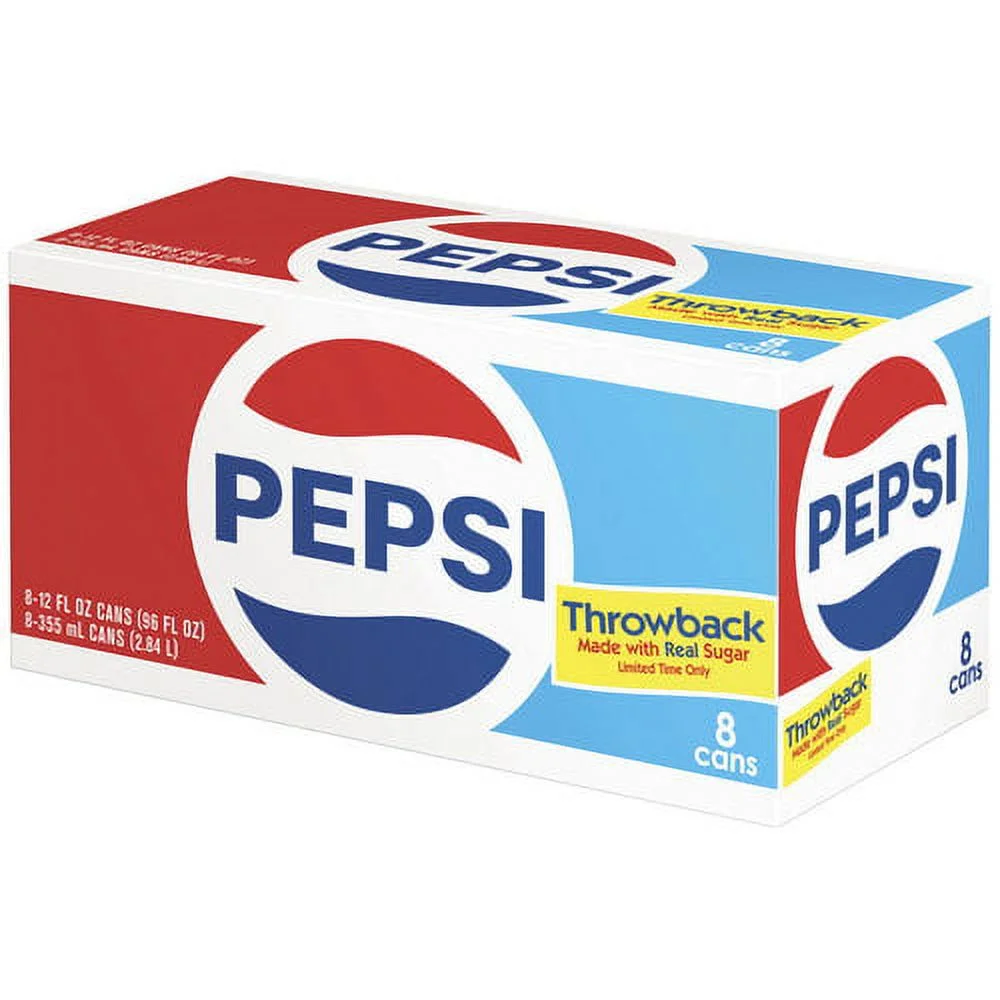


Pepsi’s Retro Packaging—Pepsi has repeatedly leaned into nostalgic design elements, blending its rich history with a modern execution.


Burger King’s Rebranding—By returning to its vintage logo aesthetic with a modernized approach, Burger King created a brand that feels classic yet contemporary.
Many coffee shops, bakeries, and boutique businesses have nailed this aesthetic—clean, minimalistic, but still inviting and warm. If you’re looking for examples, just think about the last independent coffee shop you walked into that felt right. Or that Cupcake shop with the punny name. There’s a good chance it had Mom & Pop Minimalist branding at work. Whether designers were consciously applying this approach or not, it now has a name that captures its essence.
FINAL THOUGHTS: WHY YOU SHOULD CONSIDER THIS APPROACH
Mom & Pop Minimalism is more than a branding trend—it’s a timeless strategy. It takes the best elements of small-business charm and merges them with the principles of effective, modern branding.
If you’re a designer working with small businesses, this is the kind of branding you should be encouraging. If you’re a small business owner, this is the approach that will help you grow without losing your identity.
Want to see how this approach could work for your brand?
Whether you’re rebranding an existing business or building a brand from scratch, this method is designed to set you up for long-term success.
